Data can be presented in various forms depending on the type of data collected. A frequency distribution is a table showing how often each value (or set of values) of the variable in question occurs in a data set. A frequency table is used to summarize categorical or numerical data. Frequencies are also presented as relative frequencies, that is, the percentage of the total number in the sample.
Frequency distributions and are usually illustrated graphically by plotting various types of graphs:
| Bar graph - A bar graph is a way of summarizing a set of categorical data. It displays the data using a number of rectangles, of the same width, each of which represents a particular category. Bar graphs can be displayed horizontally or vertically and they are usually drawn with a gap between the bars (rectangles). |
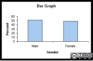 |
| Histogram - A histogram is a way of summarizing data that are measured on an interval scale (either discrete or continuous). It is often used in exploratory data analysis to illustrate the features of the distribution of the data in a convenient form. |
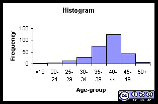 |
| Pie chart - A pie chart is used to display a set of categorical data. It is a circle, which is divided into segments. Each segment represents a particular category. The area of each segment is proportional to the number of cases in that category.
|
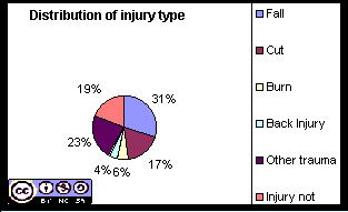 |
| Line graph - A line graph is particularly useful when we want to show the trend of a variable over time. Time is displayed on the horizontal axis (x-axis) and the variable is displayed on the vertical axis (y- axis). |
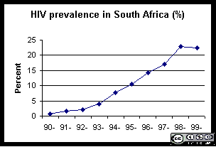 |